Project L (2XKO) | Game Launcher

brief
Project L is a 2v2 fighting game being developed by Riot Games. As an avid gamer, I wanted to explore UI/UX within the gaming sphere by conceptualizing how Riot’s new upcoming game.
The Problem
Considering visuals shared to date (2023) for Project L — what could Project L’s launcher look like? How can I draw inspiration from Riot's previous launcher designs and improve on other popular fighter games.
Opportunity
Create a dynamic and intuitive launcher that blends Project L's unique visual style with elements from Riot's previous designs.
Prioritizing human-centered design, the UI should meet gamers' needs by being familiar and easy to use. Emphasizing consistency and simplicity, the launcher will offer a seamless and enjoyable experience, drawing inspiration from successful fighter games and adapting Riot's iconography to resonate with both new and seasoned players.
Highlights
Research
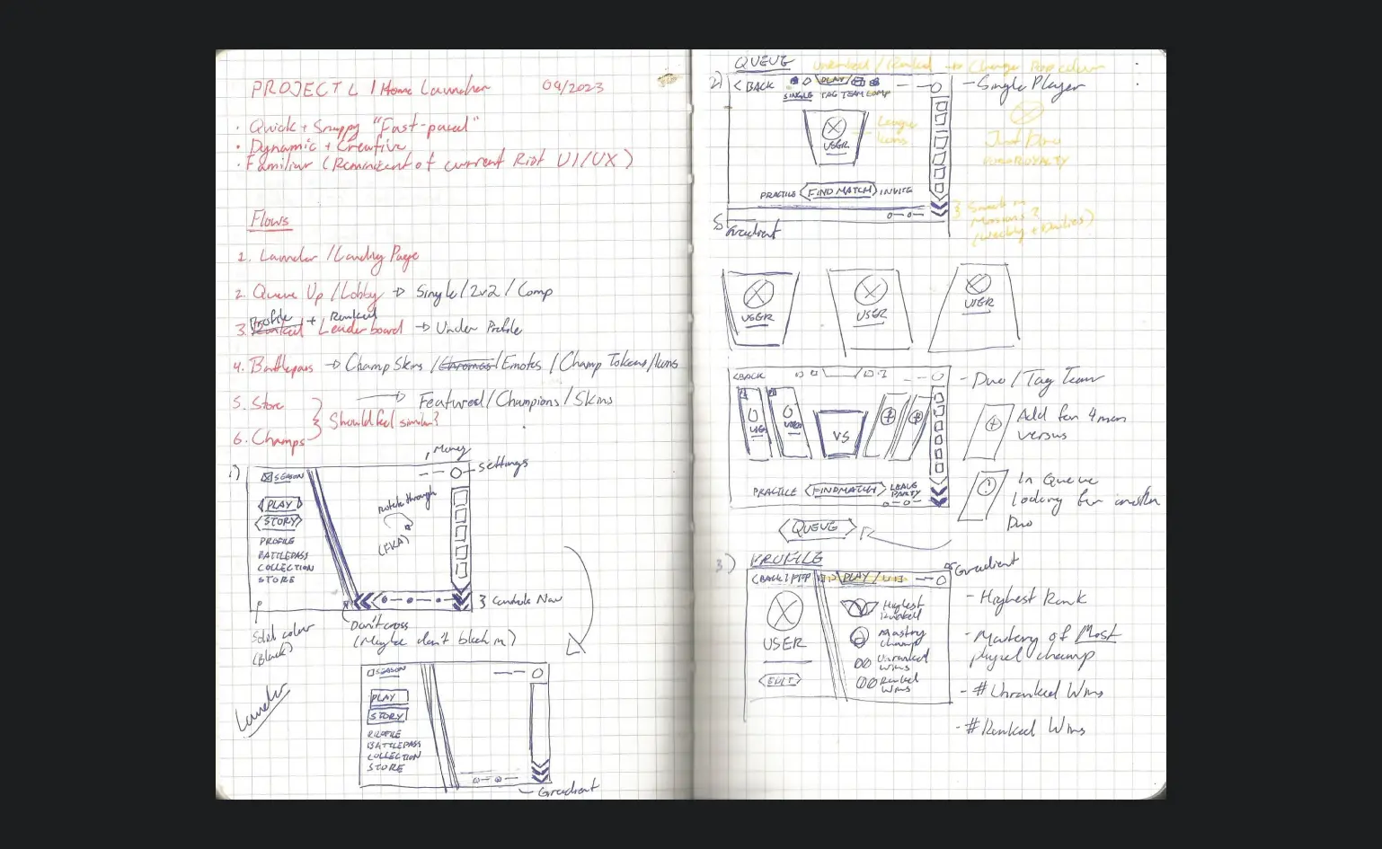
To start I conducted a visual analysis on Riot Games branding, gameplay released for Project L (as of September 2023), and the UI/UX of their other titles such as League of Legends and Valorant. Using these insights, I created a desktop prototype for Project L's main menu, lobbies for both single and tag-team, and story mode menu. My goal was to maintain visual consistency with Riot's existing games and capture the quick, responsive feel of fighter games in the UI. I also studied similar titles like Tekken, Super Smash Bros Brawl, and Street Fighter to align Project L's UI with gamer expectations within the fighting game genre as well as taking note of what was failing.
Process
Designing the UI
Based on my research and visual analysis, I identified key areas for improvement and started developing layouts in my sketchbook, focusing on visual hierarchy and emphasizing certain elements. I decided to use icons inspired by League of Legends' iconography, adapting them to align with Project L's unique visual style, since Project L draws its champions and storyline from the League universe.
Solution
Project L Game Launcher
This is my concept for a desktop launcher user interface for Project L, an upcoming game being developed by Riot Games. This personal case study was designed before Project L's release and is unrelated to the official game owned by Riot Games.
Desktop Prototype
View Prototype01 — Main menu
The main menu features the main navigation players will go through such as the play and story mode. As well as utilizes familiar key elements from Riot’s other games League of Legends and Valorant, such as the friends list and top management bar displaying the user’s currency and settings.

02 — Lobby Singleplayer
While Project L is meant for 2v2 duo play players can play as a solo tag-team fighter and control both champs at once. However players can swap between modes effortlessly through the navigation above their player card. Above the mode navigation players have condensed version of the main menu where they can even swap to story mode by toggling the “play” button.

03 — Scheduler
03 — Lobby Tag-team
In tag-team mode players can invite up to 3 friends for a custom match or just invite their duo to play against other duos looking for a fight. The layout is inspired by gameplay featuring the character selection, and is designed to smoothly transition the player cards into the character cards upon finding a match.


